Visualizing Simpson's Paradox in Covid Vaccine Efficacy

Simpson's Paradox
I recently came across a tweet which mentioned the likelihood that recent Covid vaccine efficacy stats coming out of Israel were an example of a famous statistical paradox generally attributed to the British statistician Edward Simpson but noticed by a number of predecessors (see the Wikipedia entry for details). Here's the tweet in question:
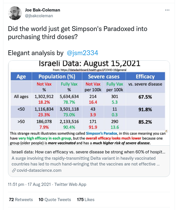
The paradox is that while the efficacy (we'll deal with how this is measured shortly) of the vaccine when assessed against the whole population of unvaccinated and fully vaccinated (67.5%) looks low, if we separate the population into over and under 50 years old the efficacy for each of those groups is considerably higher at 91.8% for under 50s and 85.2% for over 50s.
While it's very cool to have an example of a canonical paradox in the wild, one usually encountered as an interesting statistical quirk while studying the subject, in this case, as highlighted by Bak-Coleman, failure to appreciate the paradoxical results could result in detrimental policy decisions.
If we take that low efficacy of 67.5% for the whole population it suggests the need of a booster shot for the currently vaccinated, diverting those vaccines from the unvaccinated. But if we deal with the over and under 50s separately their respective efficacies at 85.2% and 91.8% seem healthy enough and suggest not diverting first and second vaccine shots to boost the vaccinated with a third.
So Simpson's paradox is not only interesting in its own right but in this case failure to appreciate it could do harm. Like most good paradoxes, Simpson's is hard to grasp and rather counterintuitive. It seems like a good candidate for some data visualization which can help people to that 'aha' moment. There are various ones about but it occurred to me that this was a good case for creating an animated chart where you clearly see the morphing of the whole of the aggregated vaccinated and unvaccinated into age related groups and appreciate the way in which this affects the measured efficacies.
Visualising Simpson's Paradox
The sections below will respond to the captions as you scroll down. The mode is set to splitscreen, with captions on the left on larger screens.
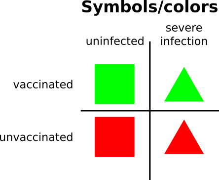
In the upcoming chart we'll use the colors red and green to mark the unvaccinated and vaccinated groups. Squares indicate an uninfected sample, triangles a severely infected sample.
We'll place a black circle at the center of samples taken from the under 50s group to clearly divide the over and under 50s.
Efficacy is the key metric when calculating the effectiveness of a vaccine. To calculate it we divide the proportion of infected people in the vaccinated group (infected divided by infected plus uninfected) by the proportion of infected people in the unvaccinated group. Note that efficacy is zero if those proportions are the same and 100% if there are no infected members of the vaccinated group.
Here we see the two groups of vaccinated and unvaccinated with their relative numbers of uninfected and severely infected. The total efficacy of the vaccine is 67.5%, a number disturbingly low.
Note that the majority of the unvaccinated are under 50 and that of those the large majority of severely infected are over 50.
Scroll down to see what happens when we separate the these groups age, dealing with the over and under fifties separately. But first make sure you agree with the calculated efficacy.
By further separating the vaccinated and unvaccinated by age we get much more positive numbers for efficacy, demonstrating Simpson's paradox in action. By focusing on the two age defined subgroups we get a very different picture for the efficacy of the Covid vaccine.
Scroll up and down between the two sections to see the transition and reassure yourself there's no sleight of hand. Try and get a feel for why the efficacies are so different between the aggregated groups and those separated by age.
Conclusion
The previous section demonstrated that by separating our vaccinated and unvaccinated population by age we get a very different indication of the overall efficacy of the Covid vaccine. If policy makers were given the efficacy of the total population (67.5%) they may well conclude a need for a booster shot for the vulnerable groups, potentially diverting precious vaccine resources from the unvaccinated. However, if they were shown the efficacy by age (92.1% for the under 50s, 85.8% for the over 50s) it is unlikely a booster shot would be found necessary. In this instance the ability to grasp Simpson's paradox is not a cool statistical insight but could have life and death consequences in the real world.