
Bespoke Charts with Svelte, D3 and LayerCake
In order to present their data on discrimination against Asian-Americans in the United States, Dataface Dataface required some bespoke interactive charts, based on some attractive inhouse designs. They wanted the charts done with Svelte and suggested using the LayerCake library, which provides a clever Svelte based scaffold for D3 etc. dataviz.
I hadn’t come across LayerCake, surprisingly, but was intrigued. Some basic exploration pursuaded me that it was worth further effort and using it for the first time would make crafting the charts an invigorating experience. Having built the charts in the (fairly tight) time available, I’m convinced it’s a great addition to any Svelte datavizzer’s armoury.
You can check out the finished site here. Here’s a brief run-down of the charts produced:
Barchart with dropdown triggered transitions
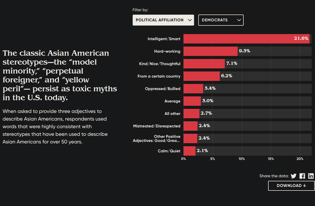
The barchart updates smoothly as the user uses dropdown options to change the reflected data. With conventional D3, this just requires the addition of a few lines (transition and duration methods) but with Svelete things are a little trickier. It’s somewhat of a black art but I’m getting there, craft wise. Having the bar width and position resize is a good test of competence here.
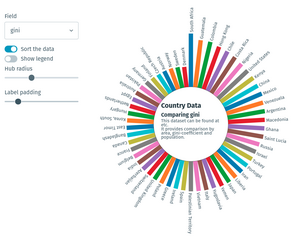
Radial barchart
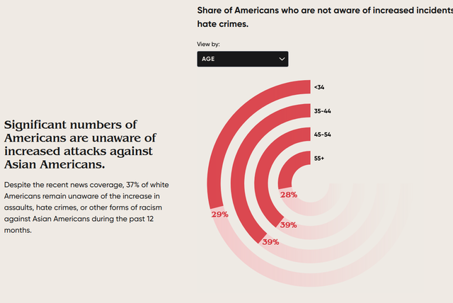
This radial chart has smooth transitions as the dataset changes. The power of Svelte (using the powerful D3 scaling module) lies in crafting bespoke charts not available in standard JS libraries - if you can visualize it and SVG can describe it, then it can be done.
Classic word-cloud
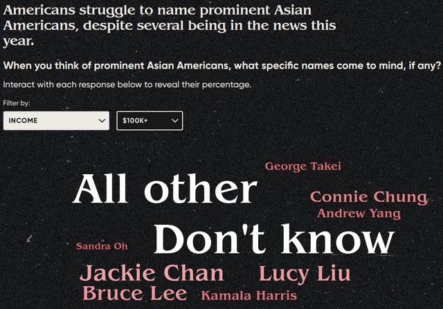
This uses a powerful JS Wordcloud library developed by Jason Davies, one of the co-creators of D3. This is hooked into a Svelte component with a few tweaks necessary to get them to play nicely.
Bubblechart with user driven transitions
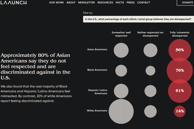
This bubble-chart adapts to changing datasets with smooth transitions. The axis tick labels needed to adapt to available space and embedded HTML with the SVG context turned out to be the right way to go and a powerful technique for SVG text-labelling in general. Text is tricky with SVG but HTML handles multi-line text, reflow etc. with ease.
Percentages with a colored grid
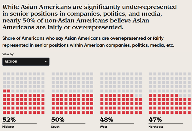
The trickiest part of this chart was getting cool transitions as the data is updated. The idea was to have the grid elements update domino style, in turn. This phased update required a few tricks with Svelte transitions - there are lots of ways to skin that cat but crafting elegant solutions is hard.