Bespoke Charts with Svelte, D3 and LayerCake
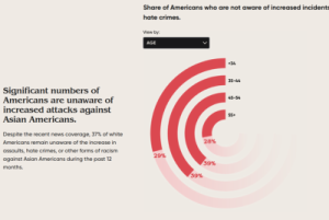
In order to present their data on discrimination against Asian-Americans in the United States, Dataface Dataface required some bespoke interactive charts, ba...
In order to present their data on discrimination against Asian-Americans in the United States, Dataface Dataface required some bespoke interactive charts, ba...
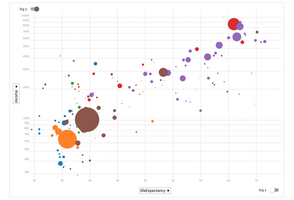
I used Svelte (with Layercake) to build a little scatterplot component with selectable axes and toggled log-plots. This makes for an easy Gapminder-alike dem...
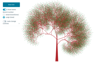
I wanted to try Svelte’s self-calling components and building some fractal trees recursively seemed a good way to do that and end up with something pretty fo...
In order to present their data on discrimination against Asian-Americans in the United States, Dataface Dataface required some bespoke interactive charts, ba...
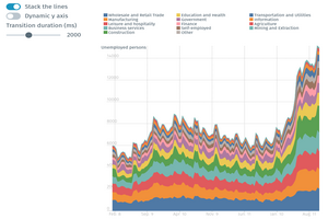
This chart transitions from a conventional multi-line chart to a stacked area chart, using Svelte transitions. LayerCake and D3 add ballast to the foundation...
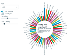
This is a little demo of a circular bar chart, built using Svelte, Layer Cake and a little D3.
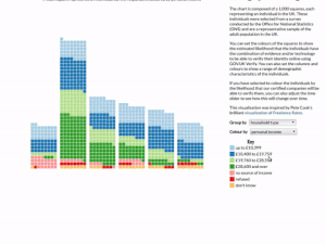
A data visualisation for the UK government’’s Verify project, allowing exploration of Verify’’s demographic coverage using a dataset provided by the Office o...
This visualisation uses a force-directed layout, courtesy of D3, to view approximately 1200 classic Jazz standards by key, date and composer. Some interestin...
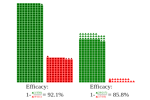
I recently came across a tweet which mentioned the likelihood that recent Covid vaccine efficacy stats coming out of Israel were an example of a famous stati...
In order to present their data on discrimination against Asian-Americans in the United States, Dataface Dataface required some bespoke interactive charts, ba...
I used Svelte (with Layercake) to build a little scatterplot component with selectable axes and toggled log-plots. This makes for an easy Gapminder-alike dem...
I wanted to try Svelte’s self-calling components and building some fractal trees recursively seemed a good way to do that and end up with something pretty fo...
This chart transitions from a conventional multi-line chart to a stacked area chart, using Svelte transitions. LayerCake and D3 add ballast to the foundation...
I used Svelte (with Layercake) to build a little scatterplot component with selectable axes and toggled log-plots. This makes for an easy Gapminder-alike dem...
This chart transitions from a conventional multi-line chart to a stacked area chart, using Svelte transitions. LayerCake and D3 add ballast to the foundation...
This is a little demo of a circular bar chart, built using Svelte, Layer Cake and a little D3.
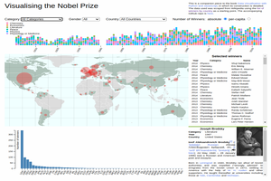
My book Data-visualization with Python and JavaScript uses a freshly scraped, cleaned and refined Nobel-prize dataset to build a JavaScript web visualization...
Introduction To quote the OpenAI Gym page, the challenge consists of:
My book Data-visualization with Python and JavaScript uses a freshly scraped, cleaned and refined Nobel-prize dataset to build a JavaScript web visualization...
Introduction To quote the OpenAI Gym page, the challenge consists of:
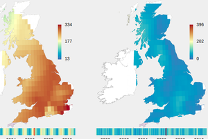
I used Python and D3 to transform some old pages of row-columnar data provided by the UK Meteorological into an animated coloured map, showing hours of...
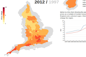
A D3 maps visualization of the change in the ratio of English house-prices to household incomes over the period 1997-2012. By warping the map of England to r...
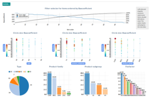
A recent client wanted a way to filter a large dataset of objects while seeing any changes immediately reflected by data-selective charts. Using ...
The course structure and some online resources for the UCL Business Management Dataviz module.
I used Python and D3 to transform some old pages of row-columnar data provided by the UK Meteorological into an animated coloured map, showing hours of...
I decided to try out Observable, Mike Bostock’s (Mr D3) latest venture, by implementing a little demo I did to show how AFrame and D3 can help bring JavaScr...
I decided to try out Observable, Mike Bostock’s (Mr D3) latest venture, by implementing a little demo I did to show how AFrame and D3 can help bring JavaScr...
The course structure and some online resources for the UCL Business Management Dataviz module.
My book Data-visualization with Python and JavaScript uses a freshly scraped, cleaned and refined Nobel-prize dataset to build a JavaScript web visualization...
Introduction To quote the OpenAI Gym page, the challenge consists of:
Introduction To quote the OpenAI Gym page, the challenge consists of:
Intro A variety of token-lists containing the word Picasso were used to produce a CLIP’s score against evolved images (see evo-canvas). Rather than using CLI...
Intro A variety of token-lists containing the word Picasso were used to produce a CLIP’s score against evolved images (see evo-canvas). Rather than using CLI...
Intro A variety of token-lists containing the word Picasso were used to produce a CLIP’s score against evolved images (see evo-canvas). Rather than using CLI...
Intro A variety of token-lists containing the word Picasso were used to produce a CLIP’s score against evolved images (see evo-canvas). Rather than using CLI...
I used Svelte (with Layercake) to build a little scatterplot component with selectable axes and toggled log-plots. This makes for an easy Gapminder-alike dem...